Form
Company
Edelman Financial Engines
Case Study
How a form helped reduce drop-off in a user flow and increase revenue by 9%
Opportunity and problem
We updated our free online retirement evaluation for users—but many couldn’t access it.
Users
People who had little to no familiarity with who we were, or how we could benefit them.
Stakeholders
VP of Marketing, Marketing Director, User Research Director, Marketing Designer
Process
Get quick and dirty qualitative research
Look for best practices on forms
Apply user research insights
Show that words are a design material
Impact
16% more users completed the flow
7% more users enrolled in Professional Management
9% increase in revenue
BACKGROUND
Imagine trying to figure out if you’ll have enough money to live on for the rest of your life.
Edelman Financial Engines helps solve this problem through financial planning and managing retirement investments. One way they do this is by partnering with companies who offer our services as an employee benefit.
As part of a marketing campaign, users received an email with a link to view a free retirement evaluation. It showed how much money users might have when they retire, depending on how much they save and how long they’ll work. Before users saw their evaluation, they needed to fill out a form to verify their identity.

Verify ID User Flow
PROBLEM
Many users were abandoning the flow at the verify ID form. The form had an important job: protecting users’ financial information. However, it had been developed without content or design input.
RESEARCH
Users:
Didn’t know who was asking for their information in this form
Didn’t understand why we were asking for their information
Had concerns about sharing their Social Security Number
Were confused about which ZIP code to enter (residential or work)
Didn’t know what we were going to do with their information

Verify ID Form: Before
THE SOLUTION
Thanks to Sara Walsh’s InVision webinar, Designing the conversation: Don't forget your online forms, I grouped the form content by:
explanatory text
field names
in-field help text
info bubble text
After reviewing the research, I made these changes:
Added a more accurate header with explanatory text
Changed fields names to Title Case per style guidelines I created
Added helper text in the ZIP Code field (and corrected the spelling of ZIP)
Added a tooltip for the SSN
Changed CTA to "Done"
Revised the language about our privacy policy
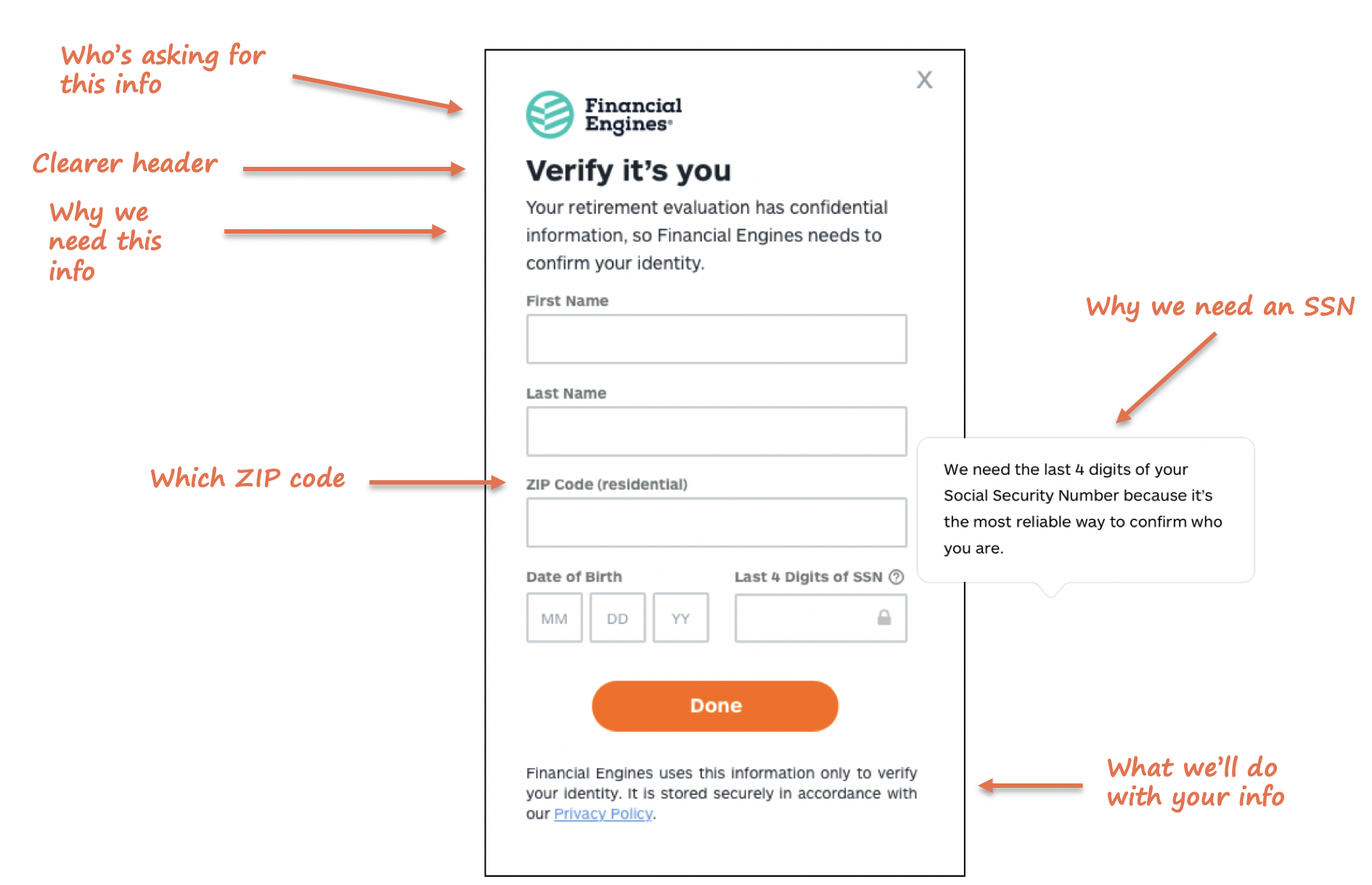
Verify ID Form: After